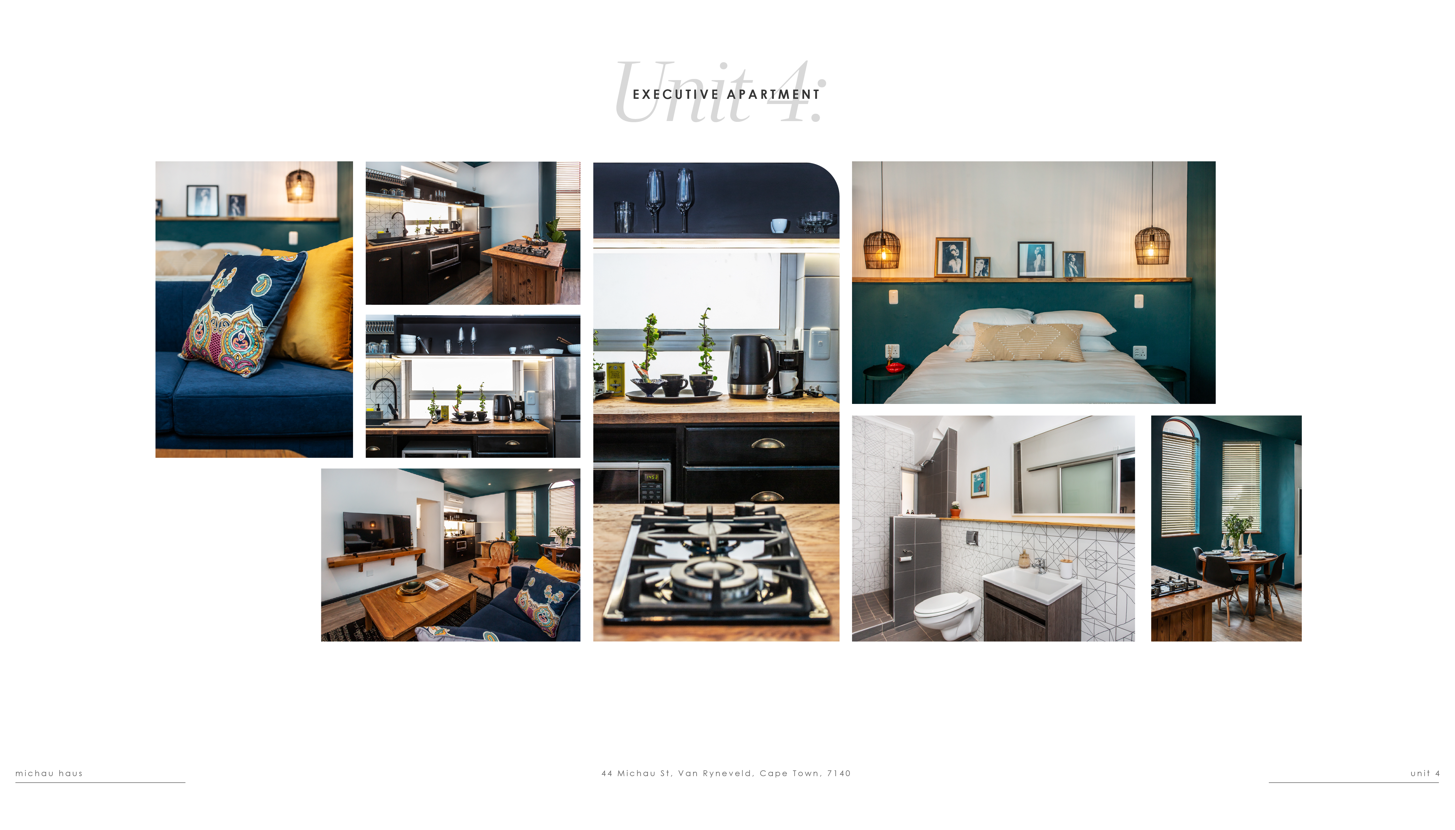
The client approached with a request to develop a distinctive visual identity and overall look and feel for Haus Michau. The goal is to create a brand presence that authentically reflects the property's character and quality, while clearly differentiating it from competing guest houses and self-catering establishments in the Strand and the broader Cape Town area.
The project was approached with the aesthetic sensibility of a high-gloss lifestyle magazine. This direction prioritises clean, considered typographic design that works in harmony with photography — allowing strong imagery to breathe while the typography frames and elevates it. The result feels editorial and polished, with a visual language that is confident without being cluttered.
Design
& Layout