Working alongside KORO RIW, the goal has been to craft a unified visual language for a multifaceted product range that blends meticulous engineering with thoughtful, elegant design. The project encompasses graphic design and branding, paired with lifelike product renderings and visualisations that showcase every detail, performance aspect, and element of their craftsmanship.
This attention to detail carries through to meticulously designed print layouts and animations that inject clarity and energy into components that would otherwise remain still. From the smallest details to the grandest visual statements, the work for KORO RIW is a testament to the power of design in communicating complex engineering concepts with clarity and style.

Brand Identity
Starting with a blank canvas, we let the client's original logo and visual identity spark our imagination, infusing the product rendering with distinctive branding details that create a memorable, personalised visual experience.
The introduction of the KORO Signet brought a signature flourish, uniting and uplifting the entire product line with a mark that unmistakably signals KORO RIW.


KBB-xTrem®
Brake Shoe
With the launch of the new KORO KBBxtrem® premium brake shoe, we set out to develop a unique logo identity that stands out from other brake shoes. Inspired by the iconic style of renowned Porsche models like the Carrera and Targa, especially their handwritten logo aesthetic, we created an organic signature logo that emphasises a personal, premium feel.
From there, the project evolved into a strong focus on render detail and visual precision, with the goal of highlighting the exceptional level of craftsmanship, engineering, and manufacturing quality that goes into every shoe and brake lining. Through carefully developed materials, lighting, and close-up product visualization, each render was designed to emphasise the fine details, construction processes, and premium standards that define the final product.
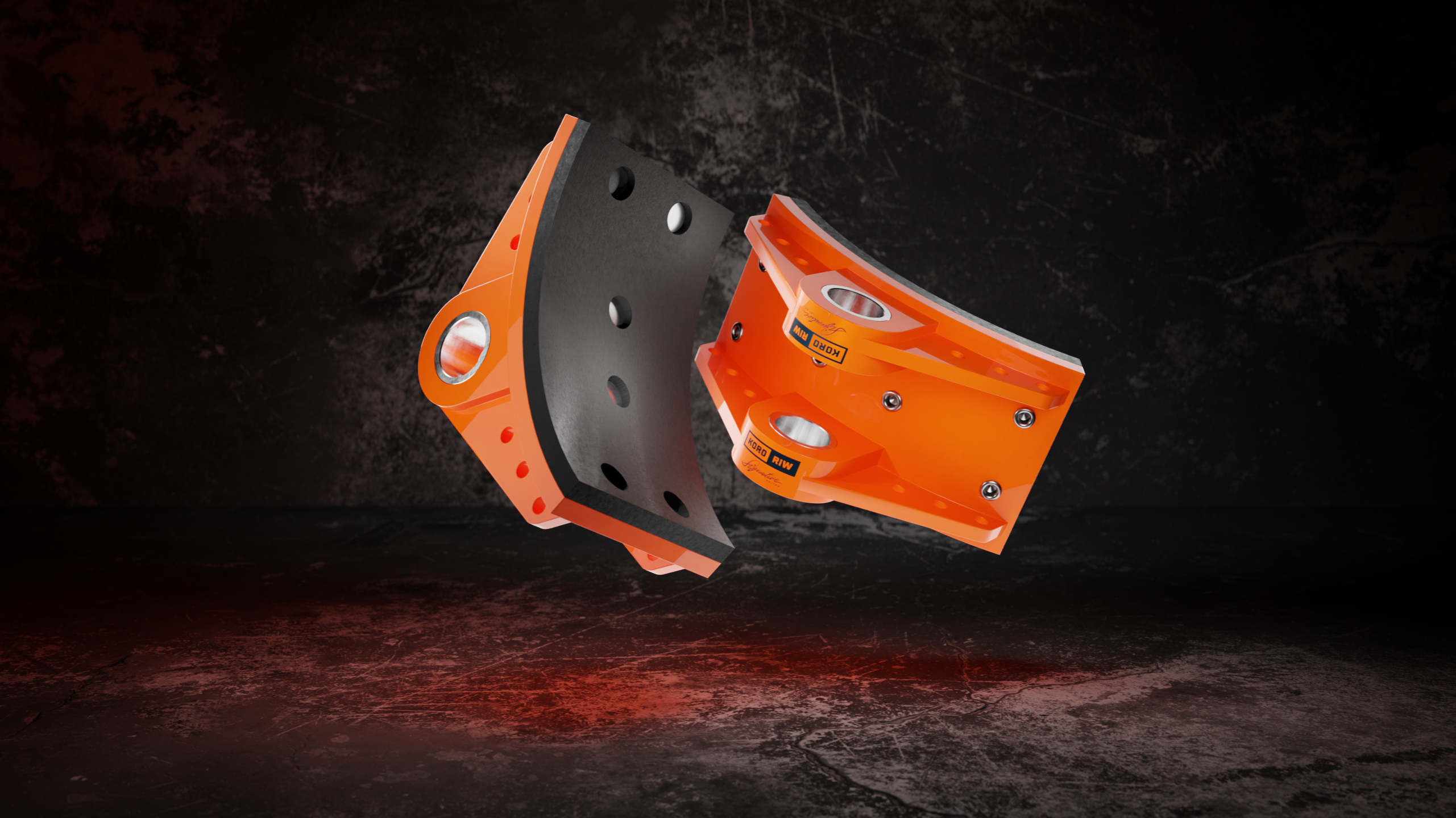

Meticulous attention to detail was applied to every render, particularly in the development of lighting, materials, and surface realism. Each image was carefully crafted to achieve a refined visual standard, accurately showcasing the textures, finishes, and material qualities of the product while enhancing the overall presentation and realism.
When considering logo placement on the product, careful attention was given to achieving maximum visibility while maintaining practicality and durability. The positioning was strategically developed to ensure strong brand presence without compromising the product’s ability to withstand everyday use, wear, and handling that could potentially damage or reduce the longevity of the logo application.

Additional
Product Renders


Design & Layout
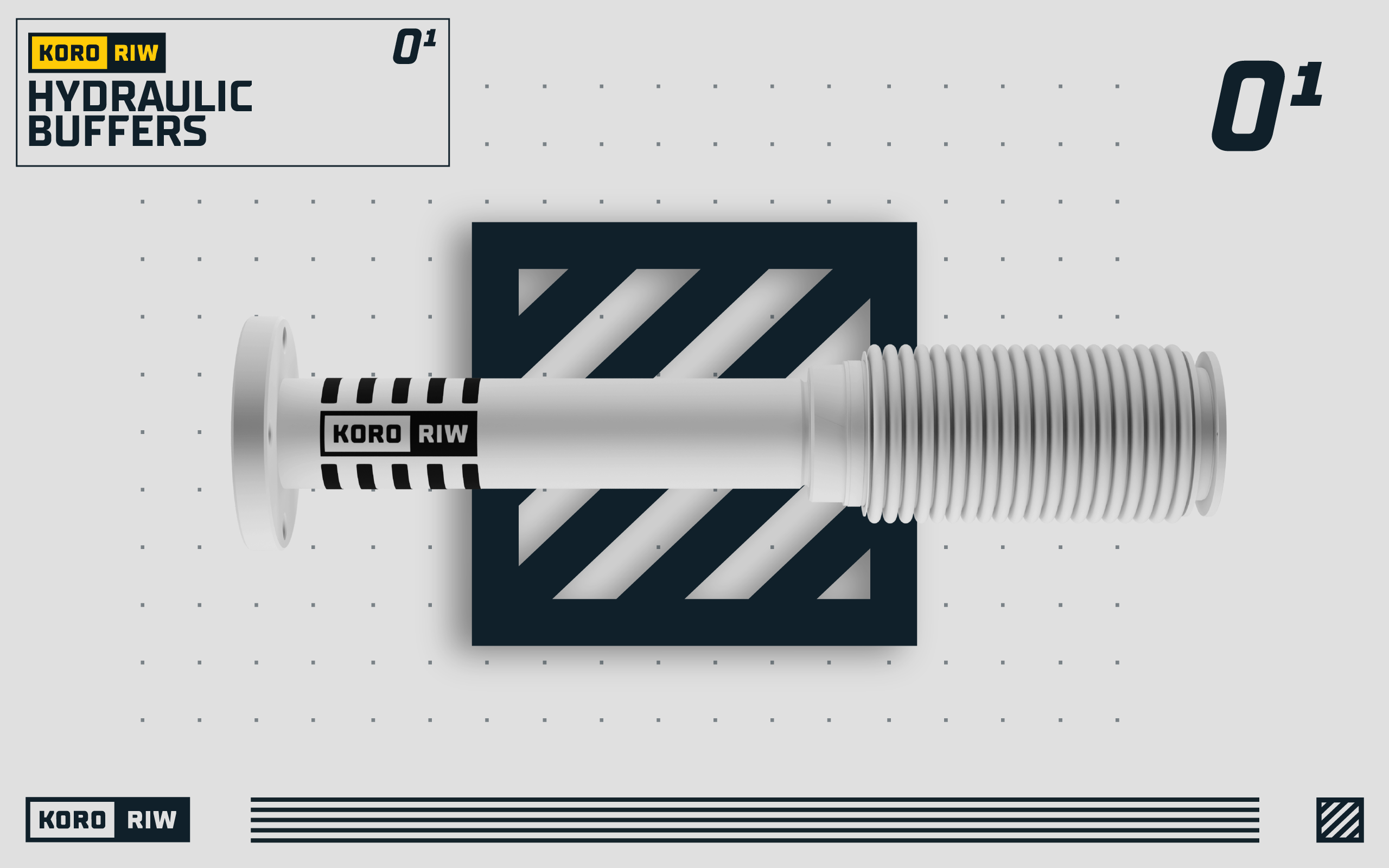
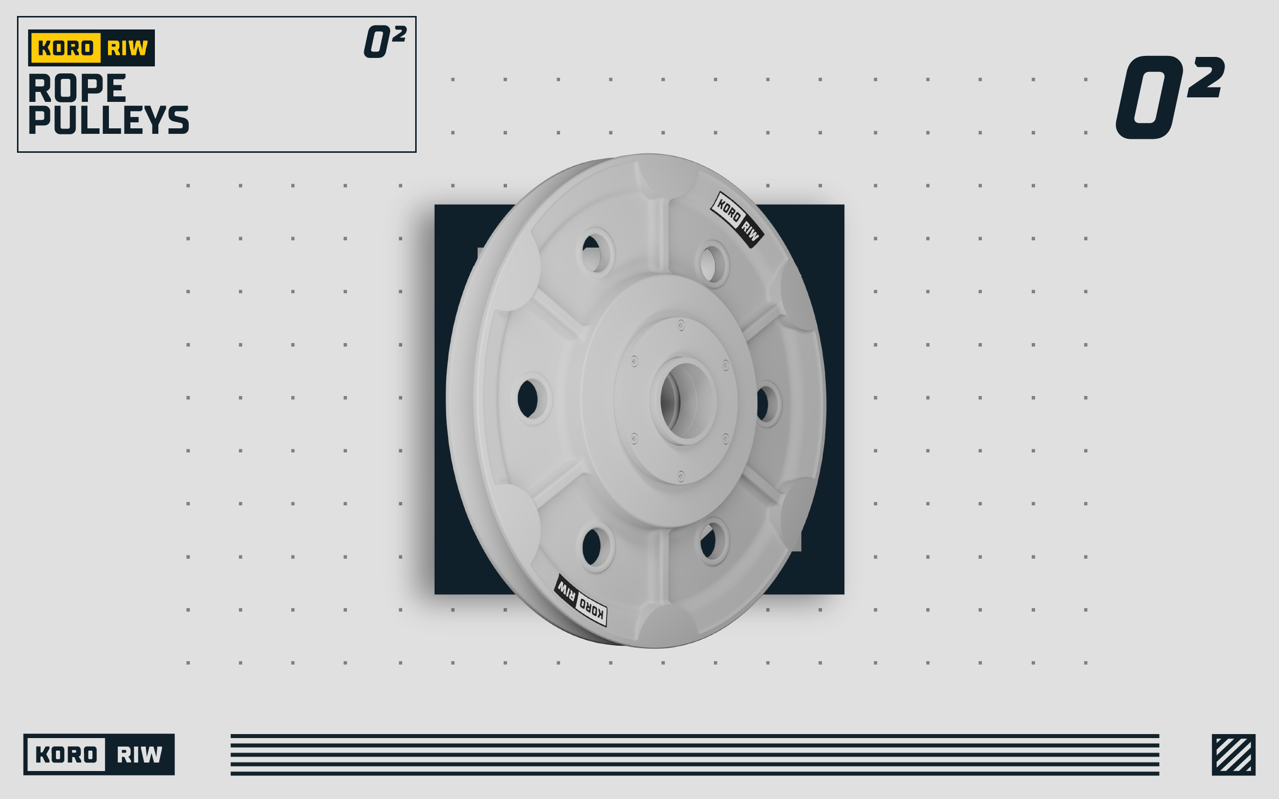
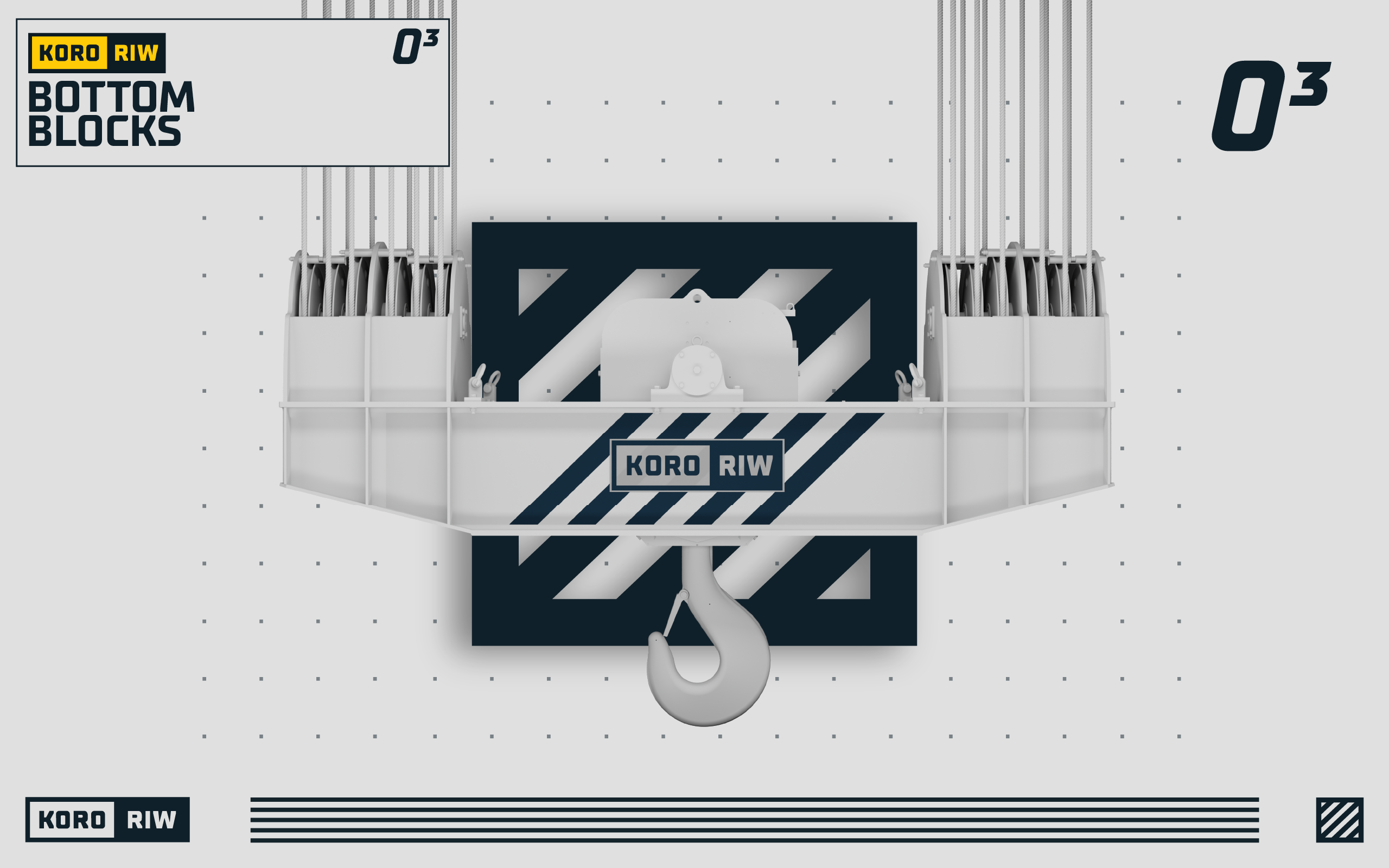
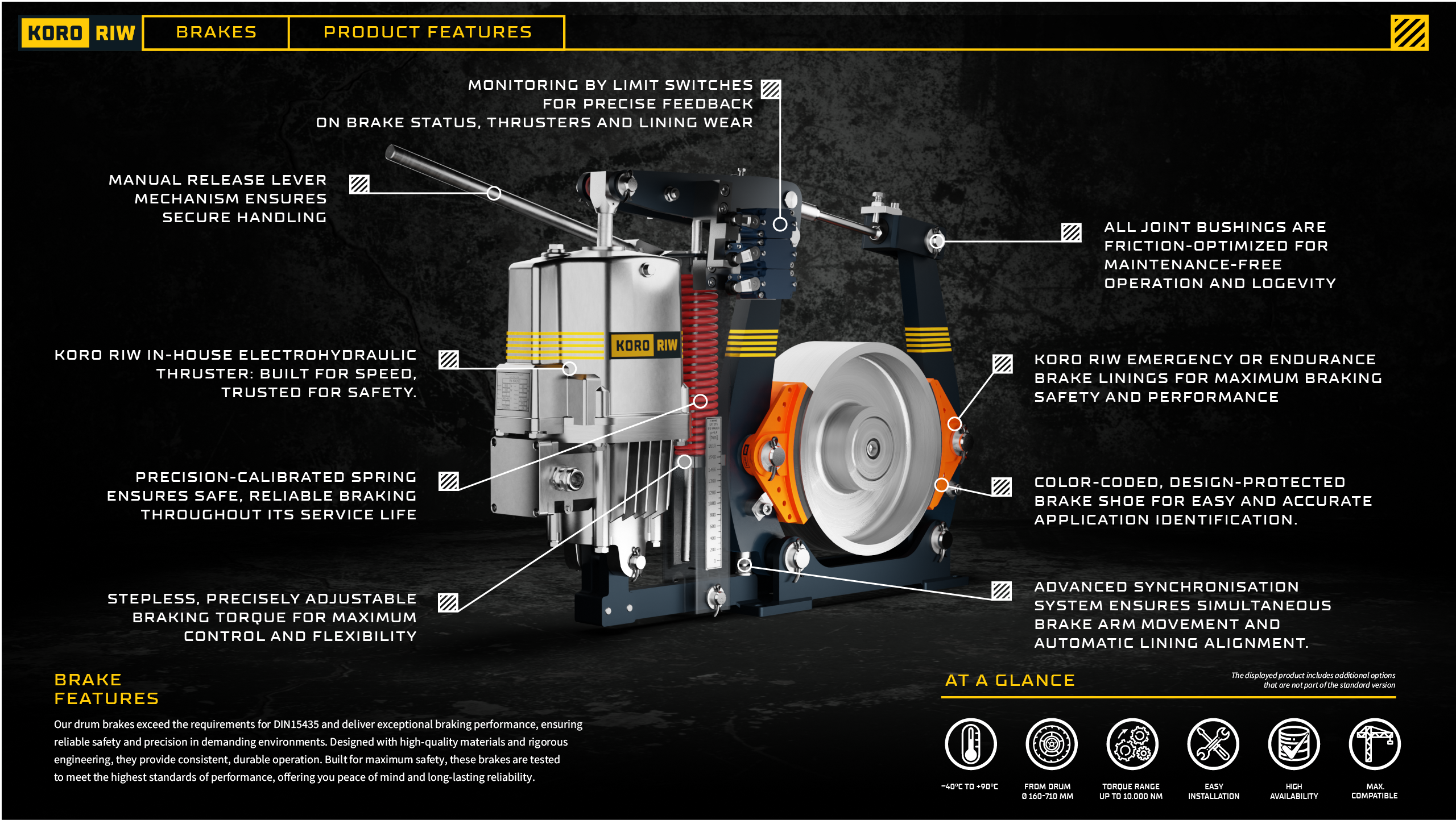
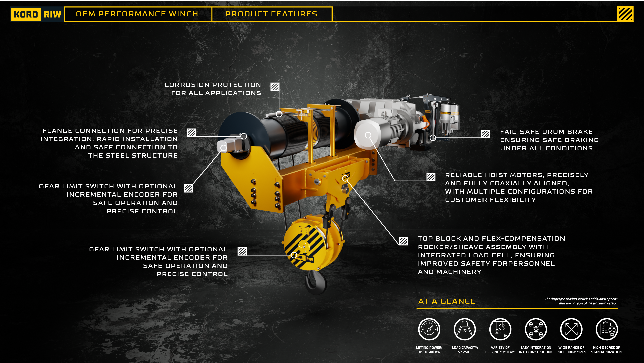
When developing image renders accompanied by informational text for both digital and print applications, the compositions were carefully designed with ample breathing room to create a clean, refined, and visually balanced layout. Every element was positioned with meticulous attention to spacing, hierarchy, and readability, allowing the product visuals and supporting information to work together seamlessly within a premium and thoughtfully crafted design system.
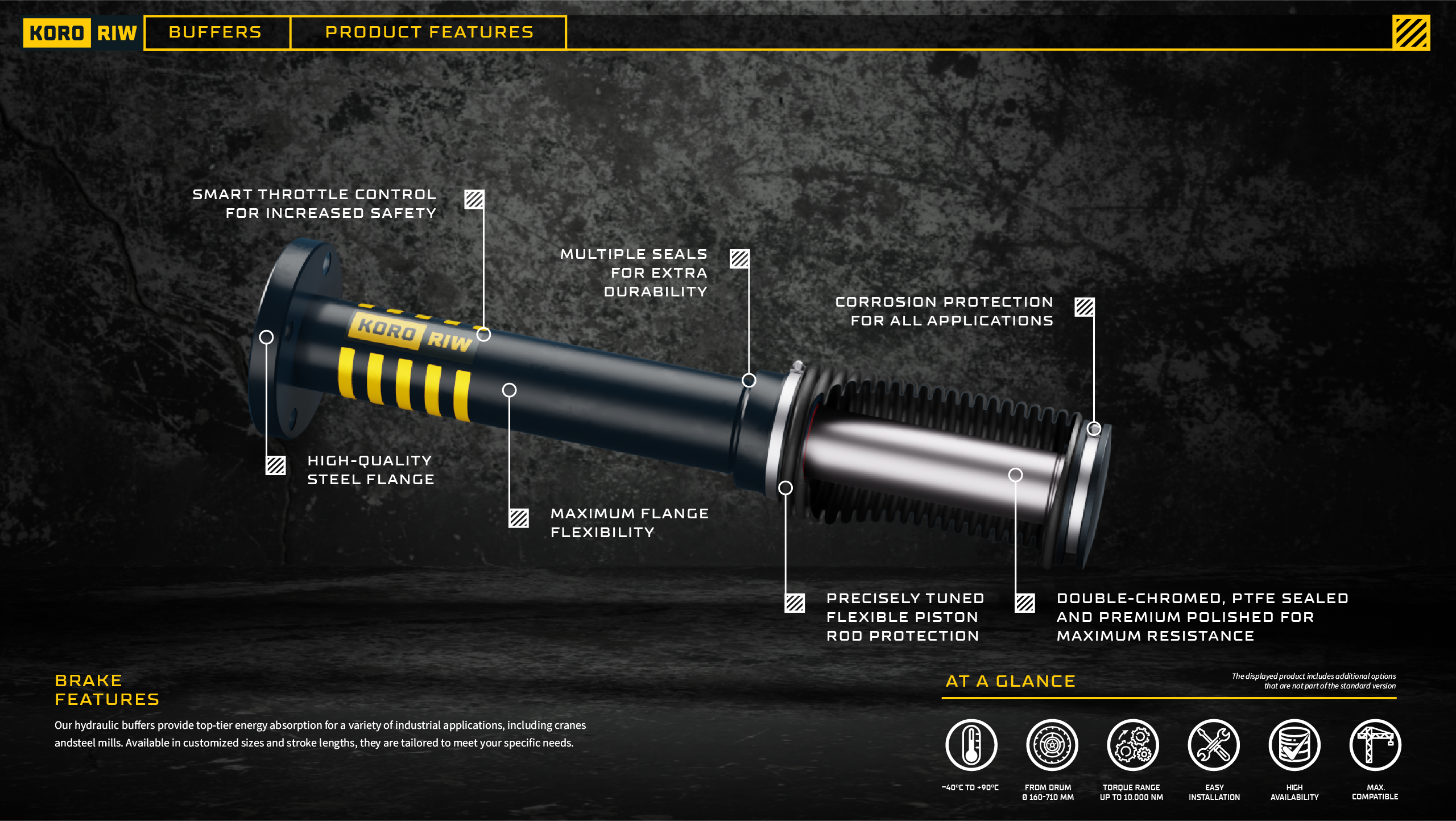
Hydraulic Buffer
Features Video
Once the initial infographic layouts were completed, the focus shifted toward developing short-form motion graphics that communicated the same information as the static designs. These animations were crafted to enhance clarity and engagement, translating key visual and informational elements into dynamic sequences that reinforce the message while maintaining consistency with the original design system.